Essays and process notes on brand, light, and the rooms people remember.
Why a brand should feel like a room
Identity is not a logo file. It is a temperature — how type, material, and silence sit together when a client walks in.
Identity is not a logo file. It is a temperature — how type, material, and silence sit together when a client walks in.
When a brand feels like a room, every surface agrees. The business card has the same weight as the reception desk. The website uses the same pause as the hallway. Photography is not decoration; it is how the room is remembered after you leave.
At 3CirclesStudio we start with atmosphere, not assets. We ask what the space should feel like at 8am, what it sounds like when empty, and which materials would still look honest in ten years. Then we translate that into type, colour, print, and pictures.
A logo can be swapped. A room stays in the body. That is the standard we design to — graphic, photographic, and interior work speaking one language so the brand is felt before it is read.
Lighting portraits without the cliche
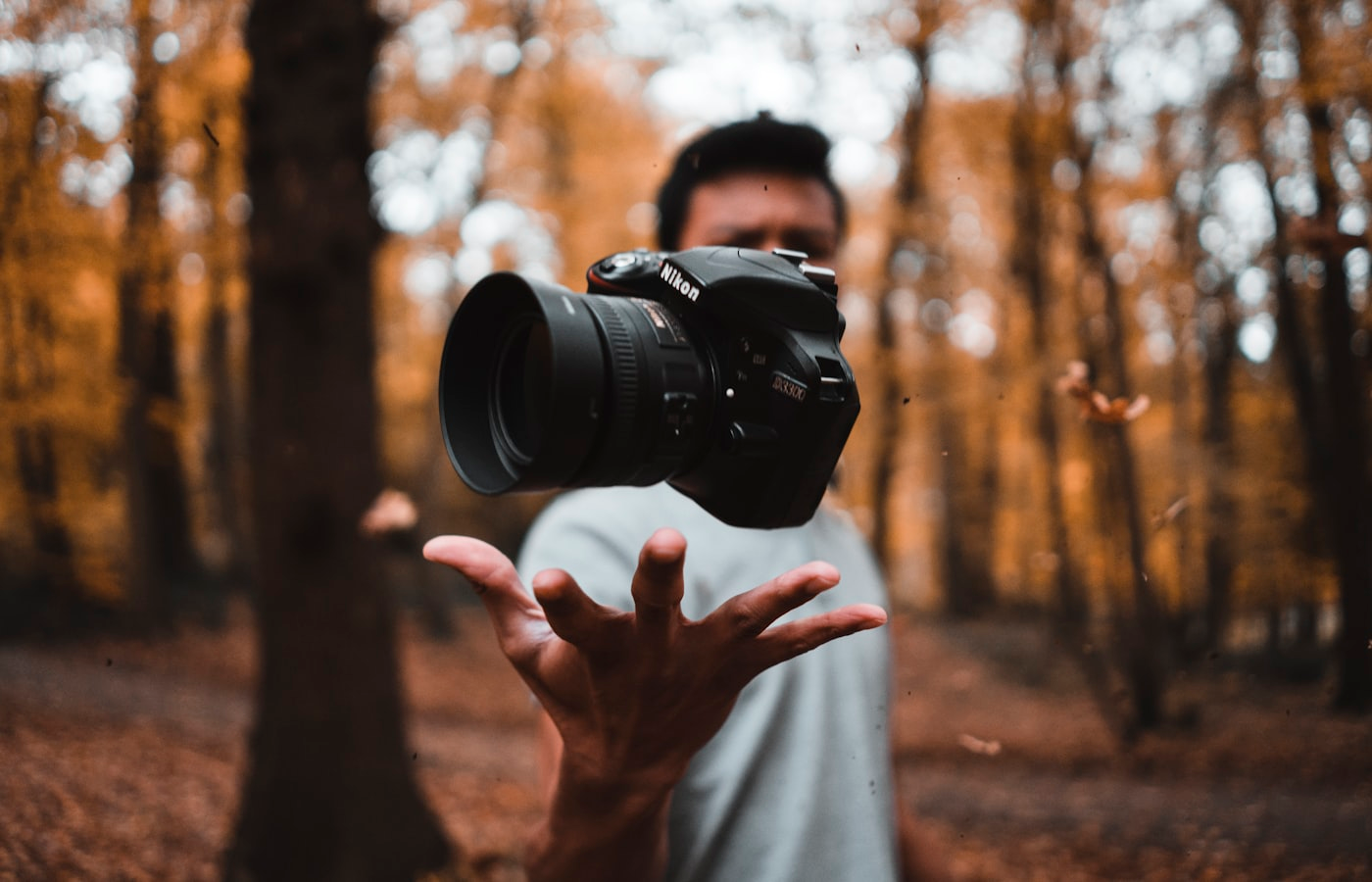
We treat skin like architecture: find the plane, protect the shadow, and let one catchlight do the talking.
We treat skin like architecture: find the plane, protect the shadow, and let one catchlight do the talking.
Most portraits fail from too much light, not too little. Softboxes from every angle flatten the face into a product shot. We prefer one key, a controlled fill, and a background that recedes. The cheekbone is a wall. The eye is a window. The neck is a corridor.
On set we meter for the highlight we want to keep and let the rest fall. A single catchlight, placed with intention, is enough to make the subject present. Retouching stays quiet — texture remains, colour stays in the skin, and the photograph still looks like a person in a room.
That is how 3CirclesStudio lights founders, teams, and editorials: cinematic, calm, and true enough to use on a website and in print without two different versions of the same face.
Materials that photograph honestly
Lime plaster, smoked oak, and linen still win on camera. Here's how we spec finishes that survive both living and lens.
Lime plaster, smoked oak, and linen still win on camera. Here's how we spec finishes that survive both living and lens.
High-gloss laminates flare. Plastic veneers go grey. Over-bright whites blow out beside a window. We spec materials that take light the way a good portrait does — with grain, depth, and a little shadow.
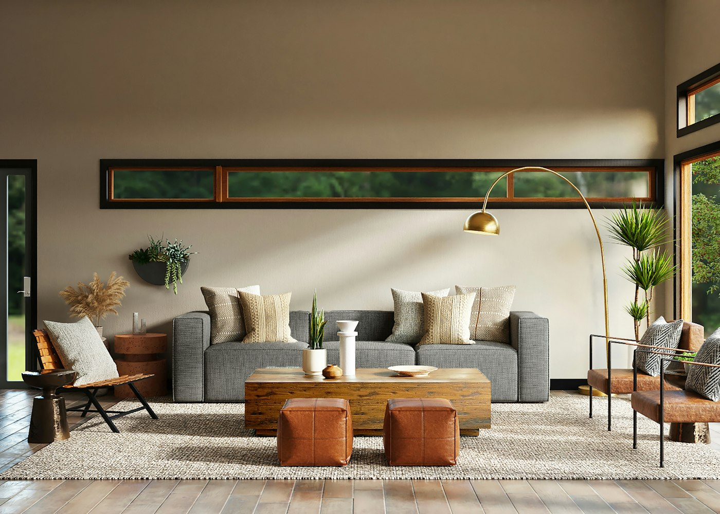
Lime plaster holds a soft gradient from morning to evening. Smoked oak keeps warmth even in cool daylight. Linen, wool, and stone read as themselves on a 50mm lens. Metals are brushed, not mirrored, so the room does not become a hall of reflections in the final plate.
For clients this means one finish schedule that works for daily life and for the campaign shoot. Interior design and photography are planned together, so the space looks inevitable in person and on screen.